Why is Santa’s Suit Red?
Posted on: December 10, 2013
RED.
Now, there is a color that evokes a response in the viewer. Doesn’t it?
Panic. Awareness. Passion.
Whichever it is suddenly you are jarred into the present and a heightened sense of alertness. It’s seductive side inspires as much as it’s urgent call to caution can send a shiver of imminent danger up your spine! Culturally the color red has been equated with heat, with fire, one of the five earth elements. We’ve all heard the term “seeing red” as a way to express intense anger or emotion and it has an exclamatory effect even in fine art without which compositions would fall short.
The power of red in art is dramatized here in this image by French landscape painter Gustave Courbet’s light touch with a simple red triangle of a ship’s sail in the distance, small but powerful.
An ‘auspicious’ color, red was selected as the identifying color for the British armed services military uniform, as early as the 17th Century, giving them the nickname of The Red Coats and later in the infamous grandeur of the Napoleonic uniform’s own ‘Turkey Red’ cloth.
The historic source for the color red is the wild herb, Rose Madder, synthesized in the 20th Century by DuPont Industries which has widely replaced the use of Rose Madder in cloth dye, yet remains much sought after by the fine arts community as paint colorant.
In any event an individual wearing a garment of red would be conspicuous in a crowd, might be considered auspicious, with beyond the norm personal charm and ability, happiness and good fortune would surely follow!
It was inevitable that the color red would make it’s way into our homes to impact our daily lives. World renown artist, William Morris, created detailed motifs for the home throughout the Arts and Crafts period of the late 19th Century many of which featured red accents.
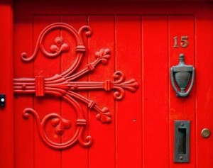
Red is undoubtedly one of the most popular front door color choices.
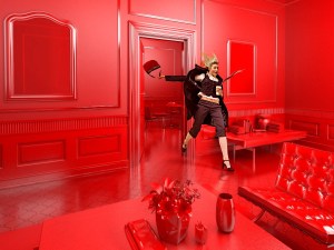
But a bright red room? Would most likely have most of us ‘on the run’!
Using red at home takes a light hand and a decisive touch, for more images of successful uses of the color red check out this blog post from Beautiful Abodes and if you are thinking of going red, beyond wearing that Santa suit on December 25th, give me a call!
Warm wishes for a wonderful holiday season!
Nancy
“Making color work for you!”
Working in Portland Oregon I have the privilege of expending the greater portion of my color consulting efforts on homes in the age range of 1890 – 1940, which covers a considerably wide range of architectural styling, mix and matches included, multi decade “remodeling” efforts that create oddly disjointed venues of style, some well done, some not so much.
One of the inherent challenges is to identify the essence of the home and then build upon that base. Be it Farmhouse, Victorian, Craftsman, Dutch Colonial or English Tudor the bones of the home are there for all to see if you look close enough. Well, perhaps not ‘all’ to see, but those “with an eye to see” let us concede.
Consider the term ‘bungalow’ which is often the default descriptor folks will resort to in their initial descriptions, there are many, many types of bungalows. A study into history will quickly show that the term though first intended to mean a simple, unadorned dwelling quickly was adapted to cover a ‘multitude of sins’.
Let’s take a quick look back into history to find the source of the term; Bungalow.
The term originated in India, deriving from the Guajarati બંગલો baṅgalo, which in turn derives from Hindi बंगला baṅglā, meaning “Bengali” and used for a “house in the Bengal style”. Such houses were traditionally small, only one story and detached, and had a wide veranda.
From it’s humble beginnings as the mud and straw structure similar to that pictured above the ‘bungalow’ was destined for greatness!
Through the British occupation the term was ‘brought home’ by the sailors and the military personnel who inhabited the East Indies and so began it’s evolution!
Espoused early on by the Arts & Crafts movement, which originated in Great Britain in the mid 19th Century, the artisan styling of what has come to be known as the “Craftsman Bungalow” exemplified their desire to return to a simpler life, rejecting the lackluster style industrialized manufacturing was leading the masses toward via la Revolution!
The Arts & Crafts movement caught on like a wildfire which was able to cast it’s sparks across the Atlantic in its blaze of glory and fortunately so, for some of the most revered architectural heritage in our fledgling country was constructed during this period.
One of the most famous American Craftsman Bungalows is the Gamble House in Southern California designed by the brothers Green, which can still be defined mainly as a modest structure, most commonly one story to one and a half stories, featuring a veranda.

Therefore I say;
Be it ever so humble, there’s no place like a bungalow!
Friend or Faux?
Posted on: May 15, 2011
| Friend or ‘Faux’? Color washing, sponge painting, rag rolling— Whatever you may know them as, ‘Faux’ finishes (pronounced ‘foe’ which rhymes with toe) are quite literally the act of applying a specific technique to any surface which gives the impression of another surface or simply put; making one thing look altogether like something other. Examples such as faux marble or wood, know as ‘Faux bois’, are found not only in painted surfaces, but also in sculptured pieces and elsewhere as designers continue to embrace the idea of bringing nature indoors. The art of sculpting faux wood creations out of concrete, such as this bench, date back as far as the 19th Century. A more contemporary form is found in this ‘faux bois’ rug by Martha Stewart. Often in a grand architectural setting we will see ‘marble’ pillars or tile done by faux artists and are ‘none the wiser’. A well done faux will truly trick the eye, but a faux gone wrong can become a foe indeed! Painted walls in recent decades became the recipient of many a novice’s attempt at a faux finish, prompted no doubt by the many television shows touting the DYI option, some decidedly more successful then others. Memories of these can conjure up enchanting images or cause sudden recoil in reminiscing about that visit to a dear friend’s home proudly displaying his/her efforts at sponge painting that would be better spent on a sheet of paper, even a small canvas better yet; not at all? Too many of us have ‘been there’ and what does one say when it’s really, really bad? Most friends just smile and say ‘You are so creative!’ rather then being brutally honest and risk hurting a friend. However these moments are all too common, when a Faux turned Foe! So is it any wonder that the question often arises regarding faux finishes as accent walls or even the simple solid color accent wall, do they still have a viable use in interior décor? The answer I am, reservedly, happy to tell you is a resounding; Yes! Light, bright, animated, subdued, aged— whatever mood you want for a room, you can use paint color as well as decorative techniques to help create it. These effects can be subtle, with translucent color layered over a similar shade of opaque paint, or bold and brassy, thanks to new metallic paints. When in doubt, seek professional guidance to beautifully integrate a fabulous faux into your home or office decor; whether it’s a wall surface or a furniture detail, given the right color & place you can display with confidence! |
Funny how this Spring season wants to sneak up on us!
Here in the beautiful Pacific NW we have had less then a week’s worth of warmth, record breaking snows and lows. Still the blue skies will open up and smile at us once every week or so, just to give us hope. So is it any wonder that those of us who live and love the weather here also love the color gray?
It is with this thought in mind I offer up these images that succinctly mix the colors of the season; a patch of blue sky amidst silver billows that seem saturated with radiant light, swathes of green, green gold and deep evergreen, the yellow promises of daffodil, forsythia and tulips blossoms all wrapped up in a comforting downy gray!
What is it about these images that moves me?
Why do they seem so appealing?
They are the colors outside my window!
 Cool & Breezy
 With just a touch of warmth.
So, go on, get ready, set the table! Spring is almost ready to unveil itself!
Have you ever stood in an open field on a warm summer day and closed your eyes just to drink in the gentle touch of the breeze swelling around you wafting away the suns heat while bringing with it the scent of fresh grass crushed under foot leaving you inspired and refreshed?
That, to me, is the definition of subtle. So light a touch it picks up and carries a little hint of whatever it passes by, around or through.
Which is exactly what I expect of a good neutral. Like that fresh breeze it takes concentration to appreciate or even notice it but without it things just wouldn’t be the same.
For months now I have been on a search for the perfect NEUTRAL. Every home needs one, or two, perhaps three; it all depends. In the process I have fallen victim to the subtle allure of the sultry simplicity of the Perfect Neutral!
Wouldn’t it be great if there were one that worked in every circumstance? But that fantasy is smashed by the array of possibilities!
When it comes to cream not many colors can compete with “Manchester Tan”, one of the Benjamin Moore Historic selections #HC81. As an interior wall color or trim it is rich option to the proliferation of whites & off whites commonly seen. Manchester Tan also offers a beautiful choices as an exterior trim choice.
Two lovely interior neutrals I have been smitten with this season are Affinity AF95 “Hush” and the offwhite selection OC16 “Cedar Key”.
For the main color for your living room, halls and adjoining spaces these are three that you can bet your money on time and again to perform in a wide variety of lighting and style conditions.
For more thoughts on neutrals and their uses in home decor contact me by phone or email or you can post a response here as a blog post.
In a world where everyone has an opinion; Let’s talk Neutral!
Recently I have had numerous inquiries about using colors other then shades of white on ceilings, again refer to previous posts regarding Light, but I want to share with you that in all the design publications, including the newest Benjamin Moore seasonal inspiration publication; Colors for your Home 2009, are showing numerous examples.
The simple answer; Absolutely!
What color or colors remains open to discussion and driven by the home’s lighting, the color on the walls and your personal taste, but in short, there are no boundries that cannot be breached if done with taste.
One client recently chose to use Golden Delicious 390, rich warm& bright spring green, between the boxed beams in her classic Portland style home with stunning results.
Color other then the classic shades of white on interior trim and moldings is another rule that is being bent if not broken. Tone on tone is carried through with great success by keeping in the same family group shadings. Also adding a punch of a contrast or richer, darker shade to give a built in the look of a “free standing” piece of furniture is also an excellent option.
Chosing shades of color whether on the walls, celings or trim can be previewed on line by accessing Benjamin Moore’s Virtual Fan Decks.
Light is Everything!
Posted on: January 10, 2009
As often as I repeat the phrase its become a virtual mantra to me; Without light we would not even percieve color, its all about the light!
In an effort to sort things out with indoor light sources my associate, Jane Freiman, color consultant and editor of Atticmag has put together the following resource guide, rather then try to one up her info gathering I requested her approval to share, I hope it is of help to you all.
“Making Sense of Light Bulb Color”
by Jane Freiman
A few days ago I changed an incandescent light bulb to a compact fluorescent in a warm yellow room. Yes, the paint color is highly mutable. But then, so is the light bulb color.
Since we cannot escape the changes coming to lighting, I am embracing them! Oy.
Here’s an account of Jane’s initial experience; perhaps we can get a discussion going on this.
Shades of Grey
Posted on: January 4, 2009
Today’s client interaction again revolved around selecting shades of beighe, tans and gray, with a smattering of green between.
The coming year’s color trends are forecasted in “Color Pulse 2010“, a high quality hardback book, published annually by Benjamin Moore, available on their website. The award winning love child of Benjamin Moore’s ‘Color Guru’ Dotie “Color Pulse 2010” looks ahead into the next 18-24 months of color trends in architeture, fashion and interior decor. In this seasons presentation Dotie had stated the return of Beighes as the neutral of choice.
Who knew? Were they ever Not a Neutral? But it’s true!
For some inspirational tone on tone calm, take a look at Benjamin Moore’s Classic selections; 981 Winds Breath; 982 Cedar Key; 984 Stone Hearth or 1002 Featherstone; 1003 Kitten Whiskers; 1005 Hazlewood or for something a bit warmer try; 1100 Sundial, 1101 Fennel Seed and 1103 Camel Back.
Warm brown based tans, beighes, taupes are all highly sought after fare.
For taupes with a sophisticated color play & depth, hints of yellow and green in a rich gray base, see; 975 Tapestry Beighe and 976 Coastal Fog. For a bit more color saturation Affinty’s AF100 Pashmina, AF150 Cotswald or AF155 Weimaraner are proven winners.
Warm or Cool grays everyone is seeking the illusive, perfect gray to give them that restful zenlike bliss which also pares well with high energy impact colors; primary and tertiary beauties such as Acid greens, Citrus yellows, Vibrant red and oranges are especially great.
One special client, Betty, is absolutely smitten with this lovey neutral grey; Benjamin Moore Classic 1570 Gray Wisp.
Rich dark browns are the impact color of choice, hands down, though some people find brown an emotional mud bath that has them drowing in their woes, the rich mahogany, red or green based browns in sultry shades such as Preview 2114-10 Bittersweet Chocolat , AF 170 French Press or AF175 Barrista; Benjamin Moore Americas Colors #AC3 Texas Leather will add rich contrast to classic and historic home’s wealth of warm white molding details.
For slighty less intensity try Benjamin Moore Classics; 1001 North Creek Brown or 1036 Deer Trail. For something entirely sensual and rich go to the Affinity color deck; AF160 Carob, AF165 Kona.
For ceilings and trim a great white is the finishing touch; AF20 Marscapone or 967 Cloud White will do the job.
As for what goes well with Brown? You name it: Lavender, Lilacs, Violets, fresh Greens, Pinks, Yellows, Peach or Orange…try some of the many gorgeous browns available in your kitchens or baths.
What the heck they even go well with gray or beighe!
Here’s to a life full of color!
PS>My secret color wish? A room entirely painted in a grassy green, like Benjamin Moores Classic #574; ‘Once Upon a Time’. Ahhhh…Lovely!
Day One 2009 – Countdown On!
Posted on: January 1, 2009
Good Morning World;
Its day one of 2009 and the countdown is on!
What will we make of the days, weeks, hours, minutes given us in the next 364?
Goals for me; Starting over from the Crash and Burn of my seven year real estate career! Financially, physically and emotionally.
Maybe this blog should be named; Born Again Boomer Beats the Odds!
Because at the moment I am jamming online rebuilding from the rubble of real estate the foundations for my dream career. ie. This Blog!
Word to the wise; When trouble comes, embrace it! It may be the answer to your prayers!
I entered the real estate arena in response to a suggestion that I could put to use my love of interior and landscape design to make some $$. Now after a bumpy seven year ride I am where I really wanted to be profession wise anyway; in the design biz.
Thank you Jesus!!
As a professional color consultant for a local Portland, Oregon Benjamin Moore paint retailer. I love my gig! It offers great opportunity to build into a full consulting service, which I have begun and will continue to build by uploading photos of projects here on this site!
Now this is nothing short of a ‘Lazarus Experience” raising my finances from the dead! For behold they stinketh!
Talk to me about your paint and color experiences, your rebirth, your business saavy, et al.
Happy New Year 2009!


